Creating a stunning garden requires more than just selecting plants; it involves a deep understanding of color theory. This foundational concept is essential in garden design and planning, as it helps you choose colors that not only complement each other but also evoke specific emotions and atmospheres. By grasping the basics of color theory, you can transform your outdoor space into a harmonious retreat that reflects your personal style. The color wheel is a vital tool in this process, illustrating the relationships between different colors. It categorizes colors into primary, secondary, and tertiary groups, allowing you to see how they interact.
For instance, colors opposite each other on the wheel, known as complementary colors, create vibrant contrasts that can energize a space. In contrast, colors that are next to each other, or analogous colors, produce a more serene and cohesive look. Understanding these relationships is key to achieving color harmony in your garden. Moreover, the psychological impact of color cannot be overlooked. Warm colors like reds and yellows can create an inviting atmosphere, while cool colors such as blues and greens tend to promote tranquility.
By thoughtfully incorporating these principles into your garden design, you can craft an environment that not only looks beautiful but also feels right for you and your family. As we delve deeper into the specifics of creating a cohesive color scheme, keep these fundamental concepts in mind to guide your choices.
Choosing a Color Palette for Your Garden
Creating a cohesive color scheme in your garden is essential for achieving a harmonious and inviting outdoor space. The first step in garden design and planning is to select a color palette that reflects your personal style while also complementing the natural surroundings.Understanding Color Theory
- Primary Colors: Red, blue, and yellow are the foundation of all other colors. Consider how these can be used as focal points in your garden.
- Secondary Colors: Mixing primary colors creates secondary colors like green, orange, and purple.
These can add depth and variety to your garden.
- Tertiary Colors: These are created by mixing primary and secondary colors. They can provide subtlety and sophistication to your palette.
Selecting Your Color Palette
- Consider the Environment: Take note of the existing colors in your landscape, such as the color of your home, nearby trees, and hardscaping elements. Choose colors that will enhance these features rather than clash with them.
- Choose a Dominant Color: Select one or two dominant colors that will serve as the foundation of your garden design. This could be a vibrant hue for flowers or a calming shade for foliage.
- Add Accent Colors: Incorporate accent colors to create visual interest.
These can be used sparingly through flowering plants, decorative pots, or garden furniture.
- Seasonal Considerations: Think about how your color scheme will change with the seasons. Opt for plants that bloom at different times to maintain color throughout the year.
Testing Your Palette
Before finalizing your choices, consider creating a mood board or using digital tools to visualize how different colors work together. This can help you see potential combinations and make adjustments as needed.By thoughtfully selecting a color palette for your garden, you can create a stunning visual experience that enhances both your outdoor space and your enjoyment of it.
Incorporating Seasonal Colors into Your Garden Design
Creating a garden that captivates the eye throughout the year requires thoughtful seasonal planting and a keen understanding of how colors evolve with the changing seasons. By incorporating a variety of plants that bloom at different times, you can ensure that your garden remains vibrant and engaging.Spring
is often heralded by the bright colors of tulips, daffodils, and hyacinths.
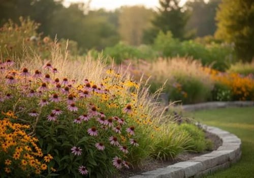
These early bloomers can be complemented by the soft pastels of pansies and primroses, creating a cheerful atmosphere as winter fades away. Consider layering these plants to create depth and interest in your garden beds.As we transition into summer , the palette shifts to bold hues. Plants like sunflowers, zinnias, and marigolds bring warmth and vibrancy. Incorporating perennials such as coneflowers and daylilies can provide lasting color while requiring less maintenance than annuals.
To maintain cohesion, select a few key colors to repeat throughout your summer plantings.In autumn , the landscape transforms with rich oranges, reds, and yellows. Consider adding ornamental grasses for texture and movement, alongside late-blooming asters and chrysanthemums. These plants not only add color but also attract pollinators preparing for winter.Finally, in winter , while many plants may be dormant, you can still create visual interest with evergreens, winterberry holly, or even ornamental branches. Incorporating hardscape elements like stone paths or decorative planters can also enhance your garden's appeal during the colder months.To achieve a truly cohesive look in your garden design and planning, consider creating a color wheel or chart that outlines your chosen palette for each season.
This will help you visualize how different plants will work together throughout the year, ensuring that your garden remains a stunning focal point no matter the season.
Using Focal Points to Enhance Color Cohesion
Incorporating focal points into your garden design is a powerful strategy to enhance color cohesion and create visual interest. Focal points serve as anchors within your garden, drawing the eye and providing a sense of structure. Here are some effective ways to utilize focal points in your garden design:- Choose a Central Feature: Select a prominent feature such as a sculpture, birdbath, or a striking tree that can act as the centerpiece of your garden. This element should harmonize with your overall color scheme, either by complementing or contrasting with surrounding plants.
- Layering Plants: Use layers of plants to create depth around your focal point.
For instance, place taller plants behind shorter ones, ensuring that the colors of the flowers and foliage lead the eye toward the focal point.
- Color Repetition: To enhance color cohesion, repeat specific colors found in your focal point throughout the garden. This could be through flowering plants, foliage, or even garden accessories like pots and furniture.
- Pathways and Borders: Design pathways that guide visitors toward your focal point. Use colored stones or bricks that echo the hues in your plants to create a seamless transition and draw attention to the main feature.
Incorporating evergreens or structural elements can ensure year-round interest.Ultimately, the key to using focal points effectively lies in their ability to enhance the overall color scheme of your garden while providing visual breaks and enhancing the experience of space. By thoughtfully integrating these elements into your garden design and planning, you can create a cohesive and inviting outdoor environment.
The Role of Textures and Shapes in Color Schemes
When it comes to garden design and planning, the interplay of textures and shapes can significantly enhance the overall color scheme. By thoughtfully incorporating various textures, you can create a more dynamic and visually appealing garden that captivates the senses.Understanding Textures in Garden Design
Textures can be categorized into three main types: soft, medium, and hard. Each type contributes differently to the perception of color:- Soft Textures: Plants with soft leaves, such as lamb's ear or ferns, can create a gentle contrast against vibrant flowers.
Their muted colors often enhance the brightness of surrounding blooms.
- Medium Textures: Plants like hydrangeas or daylilies offer a balance, providing both color and texture that can harmonize with other elements in your garden.
- Hard Textures: Incorporating materials like stone, wood, or metal can ground your design. These elements often reflect light differently, influencing how colors are perceived in relation to one another.
The Impact of Shapes on Color Perception
The shapes of plants and garden structures also play a crucial role in how colors are experienced. For instance:- Curved Shapes: Soft, rounded forms tend to evoke a sense of tranquility and can make bright colors appear even more vibrant.
- Angular Shapes: Sharp lines and geometric forms can create a modern aesthetic, often making colors appear more striking and defined.
This thoughtful approach will ensure that your garden is not only cohesive but also rich in visual interest.
Common Mistakes to Avoid When Designing a Color Scheme
Creating a cohesive color scheme in your garden design can be a rewarding endeavor, but there are several common mistakes that can derail your efforts. Here are some pitfalls to watch out for and tips on how to avoid them:- Overusing Bright Colors: While vibrant hues can add excitement, using too many bright colors can create a chaotic look. Instead, choose a few key colors to dominate your palette and use softer shades to balance them out.
- Lack of Focal Points: A garden without focal points can feel disjointed. Ensure you have standout features, such as a striking plant or decorative element, that draw the eye and provide structure to your color scheme.
- Ignoring Seasonal Changes: Plants change throughout the seasons, and so do their colors.
When planning your garden, consider how your color scheme will evolve over time. Select plants that offer year-round interest to maintain cohesion.
- Neglecting Texture: Color is important, but texture plays a crucial role in garden design as well. Mixing plants with different leaf shapes and sizes can enhance your color scheme and add depth to your design.
- Forgetting About the Surroundings: Your garden doesn’t exist in isolation. Take into account the colors of nearby structures, fences, or existing landscaping.
A harmonious relationship with the surroundings will enhance the overall aesthetic.
FAQs About Creating a Cohesive Color Scheme in Garden Design
Creating a cohesive color scheme in your garden design can be a rewarding yet challenging task. Here are some frequently asked questions that can help guide you through the process:- What is a color wheel, and how can it help in garden design?
A color wheel is a visual representation of colors arranged according to their chromatic relationship. In garden design, it can help you identify complementary colors (those opposite each other on the wheel) and analogous colors (those next to each other) to create harmony in your plant selections. - How do I choose a dominant color for my garden?
Start by considering the mood you want to create. For a calming effect, opt for cool colors like blues and greens.If you want to energize the space, warm colors like reds and yellows are ideal. Once you select a dominant color, use it as a base for your plant choices.
- Can I mix different flower types while maintaining a cohesive color scheme?
Absolutely! Mixing different flower types can add texture and depth to your garden. Just ensure that the colors of the flowers complement each other. For instance, pairing purple irises with yellow daffodils can create a vibrant contrast while still feeling cohesive. - What role do foliage colors play in my garden's color scheme?
Foliage can significantly impact your garden's overall look.Incorporating plants with varying leaf colors—such as dark green, variegated, or even purple leaves—can enhance your chosen color palette and provide visual interest even when flowers are not in bloom.
- How can seasonal changes affect my garden's color scheme?
Seasonal changes can introduce new colors into your garden as different plants bloom at various times of the year. To maintain cohesion, plan for overlapping bloom times and consider using evergreens or plants with interesting bark or foliage that provide structure during off-seasons.